Updated on by Rita Moreira
Every artist types this question into a search bar at some point, usually late at night, staring at a drawing that took hours and somehow still looks wrong. The honest answer is more encouraging than you might expect: drawings rarely look bad everywhere. They almost always look bad somewhere, and the eye finds that spot with ruthless accuracy.
This article is a diagnosis, not a lecture. We will go through the most common causes, why your own brain hides them from you while you work, and the checks that reveal them before anyone else gets the chance.
Why do my drawings look bad?
Drawings usually look bad for a small set of fixable reasons: one rushed detail sitting next to careful work, weak contrast between light and dark values, proportion errors your brain has quietly adapted to, and judging an unfinished stage too early. The viewer’s eye locks onto whichever spot breaks the drawing’s consistency, so the fix starts with finding that spot honestly.
Notice what is not on that list: lack of talent. In my experience teaching realistic drawing, the gap between a drawing that impresses and one that disappoints is almost never about ability. It is about where the attention went, and where it quietly ran out.
Realism is built in stages, and while you work you focus on one part at a time. The finished piece, though, is judged as a whole, in a single glance. That mismatch between how we make drawings and how people look at them is behind nearly every cause below. If you want the full method for building a piece stage by stage, start with my guide to realistic pencil drawing.
Why does one rushed detail drag the whole drawing down?
Because the human eye is trained to spot whatever breaks a pattern. A drawing that is 95 per cent excellent and 5 per cent hurried will be remembered for the 5 per cent, not the 95: the viewer’s attention goes straight to the point where the consistency of the work falls apart. A good drawing is one you can run your eye across and nothing jumps out.
Picture a well executed portrait where one shirt button was left unshaded. It is a tiny thing, yet it is exactly where every viewer’s gaze will land. The polished areas go unnoticed, because attention is a spotlight, and the odd one out is what switches it on.
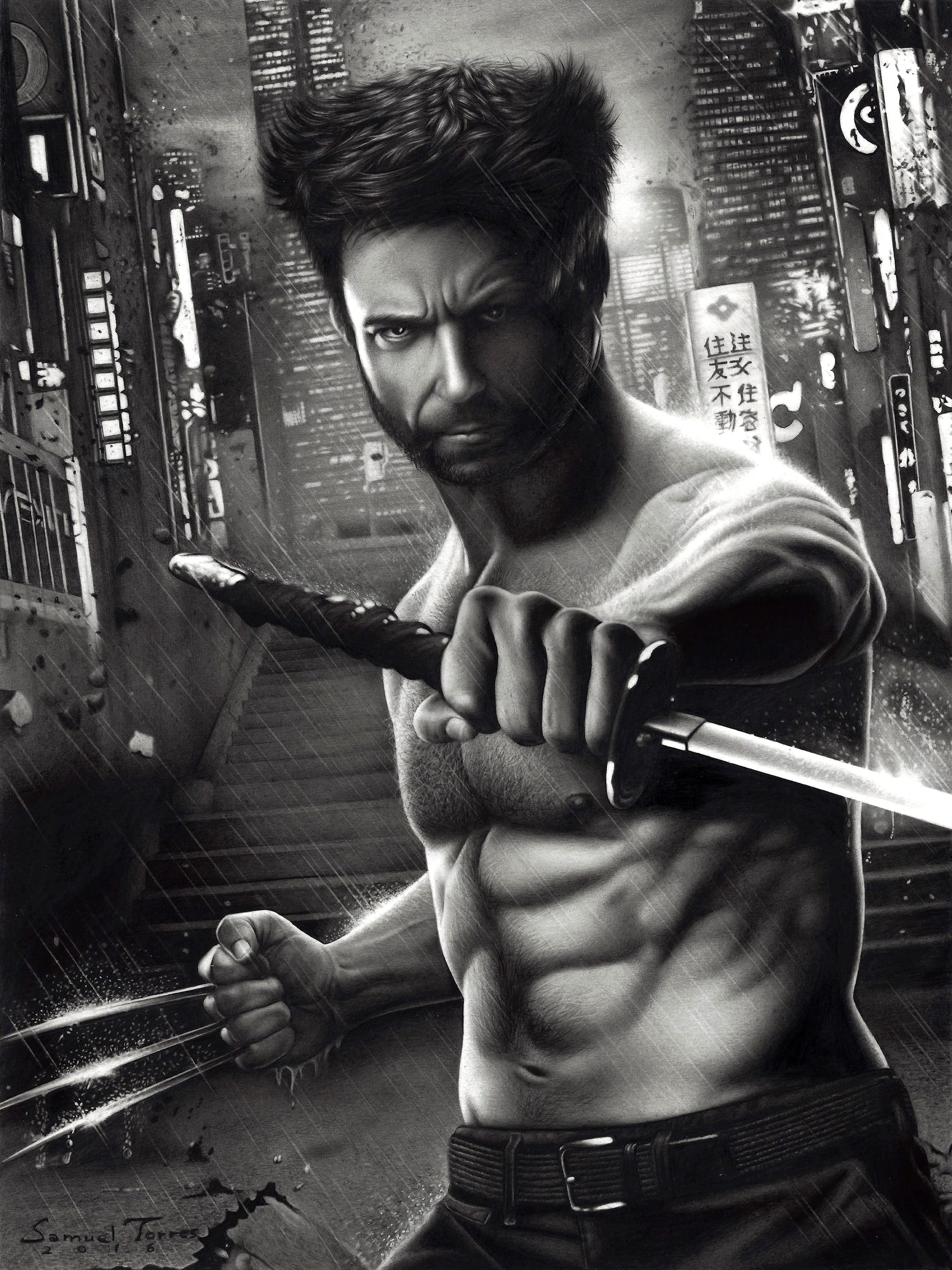
The Wolverine drawing further down this page, from our gallery, is a case study I keep coming back to. The artist gave extraordinary patience to almost everything: rain splashing off the sword, droplets lit by reflections, a meticulous city backdrop with tiny illuminated windows and debris flying in the wind. But the face was drawn freehand, in parts, without careful measuring. On a face that small, a difference of less than a millimetre shifts the likeness and the expression. The result is an impressive drawing that people meet with “it does not really look like him”. All that dedication, and the one rushed area does the talking.
Why do my drawings look bad when flipped?
Flipping a drawing looks bad because it exposes errors your brain had adapted to, not because the flip creates new ones. As you work for hours on the same image, your brain gets used to its mistakes and starts treating them as normal. Mirroring the image makes it new again, so every lopsided eye, tilted nose and drifting proportion suddenly jumps out.
This is not a modern discovery. In his Treatise on Painting, Leonardo da Vinci devotes a chapter to the mirror as “the true master of painters”: his advice is to place a flat looking glass so it reflects your work, and compare the original with the copy. Flipping a photo of your drawing on your phone is exactly the same trick, five centuries on. Leonardo, whose work hangs in the National Gallery in London, needed polished glass; you need two taps.
So when the flipped version looks wrong, take it as good news: the errors were already there, and now you can see them while there is still time to fix them.
Which causes should you check first?
Run down this list in order, because the causes at the top are the ones I find most often in my students’ work.
| Cause | Telltale sign | Fix |
|---|---|---|
| Uneven detail | One area polished, another rushed | Give every part of the reference the same care |
| Weak values | Everything sits in pale greys | Push the darks; build contrast deliberately |
| Proportion drift | Looks wrong flipped or from afar | Measure and compare against the reference |
| Rushed background | Backdrop fights the subject | Soften it or finish it properly |
| Judging too early | Half built stage read as final | Assess only after values are in place |
Weak values deserve a special mention, because they hide in plain sight. When your attention is fixed on textures and small shapes, it is easy to finish a beautifully detailed drawing that stays light grey all over and reads as flat for lack of contrast. Training your eye to read tones is the cure, and my guide to light and shadow in drawing covers exactly that. The rushed background problem has its own fix too: a soft, quiet backdrop is a skill you can learn in an afternoon with my tutorial on drawing a blurry background with pencil.
How do you spot the weak details before anyone else does?
You outsmart your own adapted eye by changing how you look at the drawing. These four checks take minutes, and I use them on every piece I work on:
- Step back two or three metres: proportion problems become obvious at a distance.
- Look at the drawing upside down or flipped: with the labels gone, your brain sees shapes and spots what it was masking.
- Photograph it and study it on your phone screen: the reduction in size and the change of medium expose imbalances.
- Walk away for 24 hours: you come back with a clean eye and the fixes announce themselves.
There is no shame in needing these checks. A full realistic portrait can take 20 to 40 hours, and nobody sustains maximum attention for that long. In the final hours, when tiredness and the itch to finish set in, secondary details get less energy than they deserve. That happens to beginners and veterans alike; the difference is that veterans notice their attention dropping, stop, and come back with fresh energy instead of pushing through.
Faces are where this discipline pays off most, because they are the highest stakes detail territory in all of realism: viewers forgive a vague background but never a wrong eye. Guides like how to draw a realistic eye and how to draw realistic lips will sharpen the individual features, and if you want the complete route to a convincing face, my step by step guide teaches every feature of the realistic face in order.
Should you fix the weak detail or start again?
It depends on whether the problem is local or structural. If the defect lives in one contained area, an eyebrow, a button, a strand of hair, and the rest of the drawing is solid, fix it: lift the graphite gently with a kneaded eraser (putty rubber), redraw with patience and blend it into its surroundings.
If the problem is structural, the proportions of the face, the placement of the eyes, the angle of the jaw, patching usually makes things worse. The drawing ends up with correction marks that attract as much attention as the original mistake. In those cases it is more efficient to start on a fresh sheet, carrying over everything the first attempt taught you. Restarting is an investment in your progress, not a failure.
Where to buy the materials in the UK
A kneaded eraser and a decent set of graphite pencils are all this article’s fixes require, and Jackson’s Art, Cass Art and Hobbycraft all stock them, in store or online. Amazon.co.uk carries the same ranges if that is easier.
Frequently Asked Questions
Why do my drawings look bad on camera?
The camera is doing what fresh eyes do: showing the drawing small, all at once and stripped of the hours you spent up close. Imbalances of tone and proportion that your adapted eye stopped registering become visible at that reduced size, which is precisely why photographing your work is such a useful check.
Two practical notes. Shoot straight on, in even daylight, because a tilted angle or harsh lamp adds distortions the drawing does not actually have. And if the photo reveals real problems, treat it as a free critique: fix what it shows, then photograph it again.
Why do my sketches look bad?
Usually because a sketch is being judged by the standards of a finished drawing. At the sketch stage there are no values yet, no contrast and no edges, and realism lives almost entirely in those later layers. Comparing a skeleton to a finished body will always disappoint.
Judge each stage by its own job: a sketch only needs correct proportions and placement. Check those with the flip test and a bit of distance, and only assess how the drawing “looks” once the main values are in. If it still looks off then, run through the causes in the table above.
Why do my drawings look better upside down?
Because turning the image over switches your brain out of labelling mode. Right way up, you see “an eye” and “a nose”, and those labels smooth over small errors. Upside down, you see only shapes and tones, which is much closer to how drawing actually works.
If the inverted version looks better, it means the shapes are fundamentally sound and the errors live in the details your labels were protecting. Use that: many artists work from an upside down reference precisely to copy shapes honestly, then turn it back to refine likeness and expression.
Did this article help you? You can buy me a coffee so I can keep creating free guides like this one.