Updated on by Rita Moreira
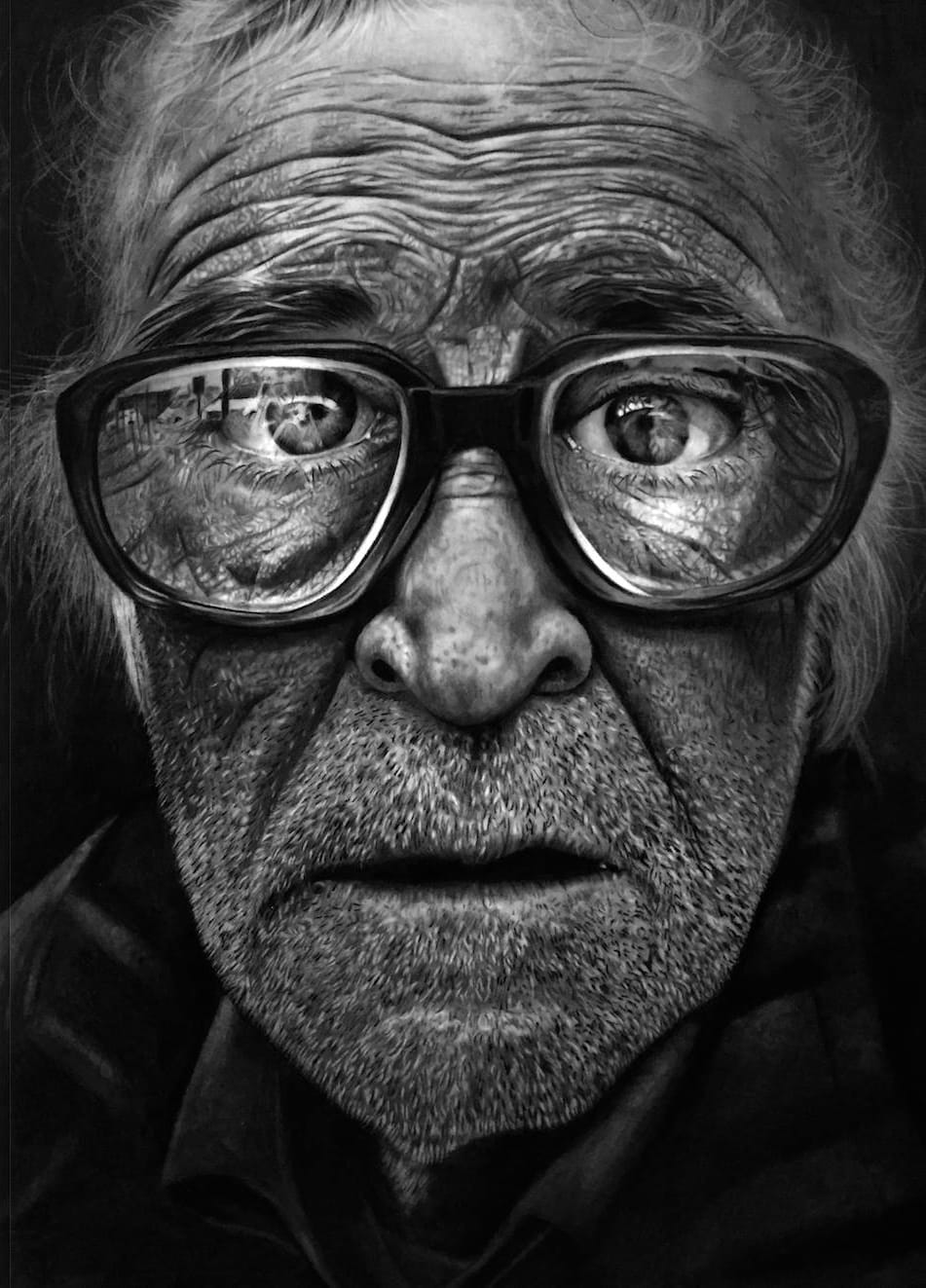
Skin texture is the detail everyone wants to jump to. Pores, fine lines, that faint stubble shadow: it feels like the part of a portrait where the magic happens, so students rush towards it and then wonder why their faces look grainy rather than alive.
Here is the uncomfortable truth I share early with every class: texture is a finish, not a foundation. In this guide we will build it in the right order, with pencil and graphite, so the pores you add sit on believable skin instead of floating on top of a flat drawing.
What is skin texture in realistic drawing?
Skin texture in realistic drawing is the simulation of the surface of human skin, its pores, subtle creases, soft highlights and small shadows, using layers of graphite applied over a base of volume and contrast that already works. It is not a standalone technique: it is the finishing layer that only makes sense once values, gradients and a light hand are under control.
Think of texture as light and shadow played at a smaller scale. Every pore is a tiny crater with its own lit rim and its own micro shadow, and every wrinkle is a narrow valley obeying the same light source as the whole head. That is why the fundamentals in light and shadow drawing come first: skin is built from exactly the same five values, just miniaturised.
Why does the base matter more than the pores?
Because a texture applied over a rushed base never reads as skin, no matter how carefully the pores are drawn. The comparison I always give my students is a make-up artist at work: before any make-up goes on, she prepares the skin with moisturiser, primer, concealer and foundation, four products whose only job is to leave the surface smooth and even.
Your blank paper is that face. Tonalising the drawing with soft, even gradations, mapping where light and shadow will sit, smoothing out blotches: that is your primer and foundation. Skip it, and it is like applying the final make-up to unprepared skin. The eyes and mouth may turn out beautifully, yet the patchy surface around them will draw more attention than either.
So before you draw a single pore, be honest about the fundamentals: can you lay graphite down evenly, without blotches, with convincing volume and contrast? A smooth, well built portrait with no texture at all often looks better than a fully textured one on a weak base. If that groundwork still feels shaky, start with our guide to realistic pencil drawing and come back: the texture will then arrive surprisingly easily.
How do you draw skin texture with pencil?
Once the base is solid, skin texture with pencil comes down to five moves, each done gently. Work with a light hand throughout: texture is whispered, never shouted.
- Build the base first: even, smooth gradations of tone across the whole area, with the main volumes of forehead, cheeks and nose already modelled.
- Confirm your light direction, because every crease and pore will cast its tiny shadow on the same side as every other shadow in the drawing.
- Draw the fine details with harder grades such as H and HB, kept well sharpened: they give delicate, low-grain strokes that sit quietly inside the skin. Manufacturers grade graphite precisely for this range of jobs; Faber-Castell’s Castell 9000 series alone comes in 16 hardness grades.
- For deeper accents, a 0.5mm mechanical pencil loaded with 4B lead reaches into creases and nostril shadows with real intensity but a tiny footprint.
- Finish each region with a clean, soft brush. It fixes the graphite and softens it at the same time, knitting your marks into the surrounding tone.
A slightly rounded pencil tip is fine for broader, softer texture; save the needle point for the crispest details. And for shine, sweat or a highlight on the bridge of the nose, lift graphite out with a kneaded eraser (putty rubber) rather than trying to shade around it.
How do you draw pores on a face?
Well drawn pores are almost invisible at first glance: they only reveal themselves when the viewer leans in. Use a sharp H or HB and place light dots with irregular spacing, and only in the midtone areas of the skin. Pores disappear in bright highlights and drown in deep shadow, so drawing them there instantly breaks the illusion.
Random spacing is the part beginners underestimate. Evenly distributed dots read as printed fabric, not skin: real pores cluster, drift and fade. When I texture a forehead, I let the dots gather a little in some patches and thin out in others, then pass a very soft brush over the area so the points melt into the tone underneath. One light pass is enough; scrubbing lifts the base you worked so hard to build.
Less is more here. A face covered edge to edge in emphatic pores looks ill or artificially aged. The same restraint applies around the features: the skin transitions around a realistic eye or along the edge of realistic lips are where subtle texture earns its keep. If faces are what you love drawing, I have gathered the whole sequence, eyes, mouth, hair and skin texture, into a complete step by step guide to realistic features.
Which paper is best for drawing skin texture?
Smooth paper is the usual choice, because the pencil glides and the paper’s own grain stays out of your pores. Bristol board is the classic: Hahnemühle, the German mill making paper since 1584, and Winsor & Newton both offer it. Lightly textured sheets work too, and Italy’s Fabriano, papermakers since 1264, are a favourite for skin with a touch of natural grain.
| Paper type | Surface | Best for | Watch out |
|---|---|---|---|
| Bristol board | Very smooth | Fine pores, precision | Saturates quickly in darks |
| Lightly textured | Subtle grain | Natural-looking skin | Grain shows in highlights |
| Coarse sketch paper | Heavy grain | Loose studies only | Grain overpowers drawn pores |
There are no absolute rules, though. Some artists deliberately use the paper’s grain to do part of the work, letting the tooth suggest texture that the pencil only reinforces. Once you know your materials, creativity decides: the same logic that keeps a face sharp while the surroundings stay soft in a blurry pencil background applies to choosing where texture appears at all.
Where can you buy the materials?
Everything in this article amounts to a modest list: H, HB and 4B pencils, a 0.5mm mechanical pencil, a soft brush and a pad of smooth Bristol paper. In the UK you will find the lot at Jackson’s Art or Cass Art online, in a local Hobbycraft, or on Amazon.co.uk if you would rather order everything at once.
Frequently Asked Questions
How do you make skin texture look smooth?
Smoothness comes from the base, not from blending at the end. Lay your graphite in light, patient layers with soft circular or directional strokes, keeping the pressure low so no single pass leaves a hard mark.
Then use a clean, soft brush to unify the tone: it fixes and softens the graphite at once. If the skin still looks blotchy, the fix is more careful layering with a harder grade, not more rubbing. Heavy blending on top of uneven tone just produces smooth blotches.
Can you draw skin texture with charcoal?
Yes, and it excels where graphite struggles: deep shadow areas and rich, dark skin tones, because charcoal reaches blacks that graphite cannot. The trade-off is control, as charcoal is far less forgiving of a heavy hand and smudges easily.
A practical compromise is graphite for the base and the fine pore work, with charcoal pencils reserved for the darkest accents: nostril shadows, the line between the lips, the deepest creases. Our guide to charcoal pencils in realistic drawing covers the pressure control this combination needs.
Is skin texture easy to draw?
Easier than its reputation suggests, provided you respect the order of learning. A simple readiness test: can you shade a sphere with clean transitions between light, midtone and form shadow, with no blotches or stray strokes? If so, texture will come quickly.
If you jump ahead, the pores and highlights land on a surface with no real volume and the result looks artificial. Spend the time on gradations first: texture is a finish applied over structure, and it genuinely is not difficult once the structure is there.
Did this article help you? You can buy me a coffee so I can keep creating free guides like this one.