Updated on by Rita Moreira
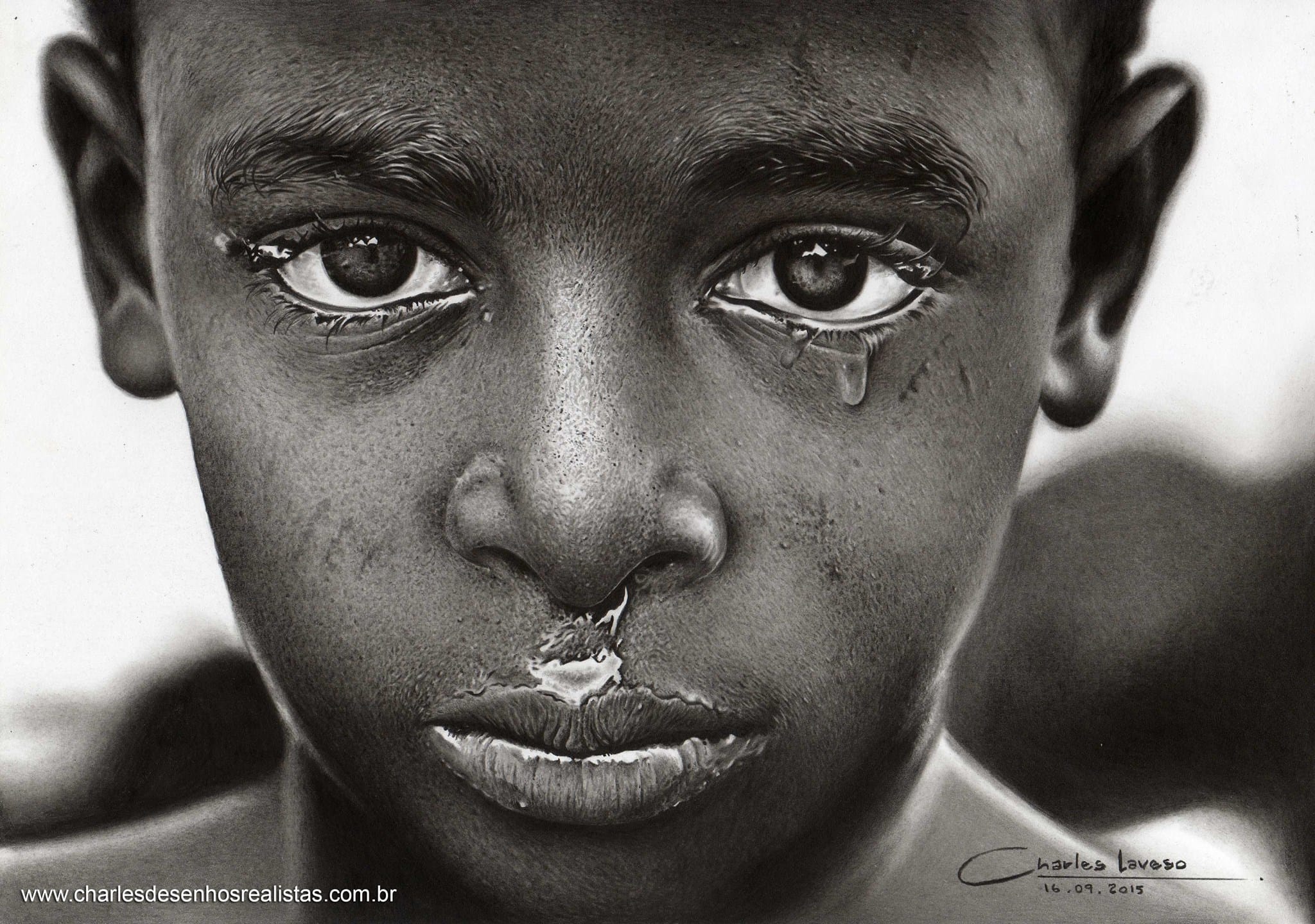
Coloured pencils had their moment of fame when the adult colouring boom took off, led by Scottish illustrator Johanna Basford and her Secret Garden books from 2013. But the same humble pencils are also behind complex, patient works of hyper realism that are routinely mistaken for high definition photographs.
If you already draw with graphite, you are closer to that level than you think. The sketching stage is practically identical; the differences begin when the colour starts going down. Here are the four things worth knowing before your first serious attempt.
How do you make a realistic coloured pencil drawing?
A realistic coloured pencil drawing is built by layering colour over a precise sketch: you work with a sharp point and light pressure, place the dark values first to anchor the volumes, and blend by adding gradual layers rather than rubbing. Because wax based pigment cannot be smudged like graphite, each layer has to land as a ready gradient.
That last point is the real dividing line between the two techniques. In graphite, a blending stump forgives a clumsy patch of shading. In colour, the blending stump plays only a small supporting role, so the softness has to come from your hand. Everything else, the photo reference, the careful sketch, the reading of light and shadow, transfers straight across from realistic pencil drawing as you already know it.
1. Which coloured pencils do beginners actually need?
Cheap ones, honestly. Any school grade set from a stationery shop is enough to start practising: what matters at the beginning is getting familiar with how the pigment sits on the paper and how colours interact, not the badge on the tin. In the UK you are spoilt here, because Derwent has been making pencils in the Lake District since 1832 and its Academy range is priced for exactly this stage.
| Level | Typical lines | What you get |
|---|---|---|
| Starter | Derwent Academy, school grade Faber-Castell | Standard wax, more layers needed for deep tones |
| Serious hobby | Derwent Coloursoft | Softer core, richer colour per pass |
| Professional | Polychromos, Caran d’Ache Luminance, Prismacolor | Dense pigment, smooth transitions, fewer layers |
It helps to know what is inside these pencils, because it explains their behaviour. A coloured core is not clay and graphite: it is pigment bound in wax with fillers such as kaolin, the same white china clay Cornwall is known for. Faber-Castell‘s professional Polychromos line, 120 colours strong, uses an oil based binder instead, which is why it layers so cleanly. Wax or oil, the finish is naturally a little more porous than graphite, so choose a smooth paper and keep the point sharp: I sharpen normally, then maintain the tip with a craft knife, and only return to the sharpener when the point gets too short to work with.
2. How do you plan the drawing before the first colour goes down?
Exactly as you would in graphite: sketch first, fill later. A lightbox lets you trace the reference photo faithfully, and ordinary graphite transfer by tracing costs nothing and gives a very similar result. Precision at this stage is cheap; corrections later, under layers of wax, are not.
Then comes the step beginners skip at their own cost: find the light source in the reference and map which regions will stay light and which will fall into shadow. The alternation of light and dark is what creates depth and makes a drawing read as real, and that logic does not change one bit when colour arrives. If values are still a fuzzy concept for you, my guide to light and shadow in drawing is the place to solidify them, because in colour work your perception has to track three things at once: light, detail and hue.
3. How do you layer and blend the colours?
With a sharp point, light pressure and patience. My working routine, layer by layer, looks like this:
- Test the freshly sharpened point on a scrap of the same paper before it touches the drawing.
- Establish the darkest regions first, gently, so the volumes are anchored from the start.
- Build each area in several light layers, letting texture and form accumulate gradually.
- Shape every gradient as you lay the colour down, because there is no stump to rescue it afterwards.
- Reserve heavier pressure for the very last passes, once the layers underneath are complete.
That final heavy pass has a name worth knowing: burnishing. You press a light coloured or colourless pencil firmly over the finished layers so the wax melts together, the paper grain fills in and the surface takes on a soft sheen. It is a finishing move, not a shortcut, because once an area is burnished it accepts almost no new colour.
For finishing touches, a few small tools earn their place: a fine eraser pen for lifting light effects, a brush or blending stump for discreet softening in small areas, an embossing tool for pressing in light hairs before the colour goes down, and a white gel pen for the final bright spots. Skin is where this layering approach shines brightest, with warm and cool tones woven over each other; my guides to drawing skin texture and drawing realistic lips show that logic feature by feature, and if you want the whole journey in order, my step by step guide to drawing every feature of a realistic face was written for exactly that. The same layering, softly and without outlines, is how you pull off a blurry background in colour, too.
4. Why does graphite practice speed up your colour work?
Because almost everything that makes colour work look realistic was learnt in monochrome first: proportion, light and shadow, gradients, pressure control. Graphite teaches those fundamentals without the extra variable of hue, so each skill gets your full attention. None of it is a divine gift; it is built by consistent practice, in colour exactly as in grey.
The practical consequence, and the advice I give every student who asks where to start: put in a stretch of consistent graphite work first, in the region of 6 to 12 months, and colour will feel like a natural extension rather than a second apprenticeship. Start with colour instead, and you are juggling two new variables at once, technique and colour, which slows both down. The only genuinely new skills waiting for you in colour are choosing hues and knowing how to weave them together.
Where to buy the materials in the UK
Every pencil and tool mentioned here is stocked by Jackson’s Art and Cass Art online, or on the shelves at Hobbycraft, and a school grade set from WHSmith is a perfectly good starting point. Amazon.co.uk carries all the same ranges if you prefer.
Frequently Asked Questions
How do you blend coloured pencils without a blender?
The most reliable blender is layering itself: several light passes of neighbouring colours, laid with a sharp point, merge optically into a smooth transition. Shape each gradient as you go, because unlike graphite, wax based colour cannot be pushed around afterwards.
Beyond that, a folded tissue can soften small areas gently, and burnishing with a light or colourless pencil melts the layers together at the finishing stage. What does not work is scrubbing: pressure applied too early flattens the paper grain, saturates the surface and leaves the area unable to take further colour.
What is burnishing in coloured pencil drawing?
Burnishing is the finishing technique of pressing a light coloured, or completely colourless, pencil firmly over layers that are already complete. The heavy pressure fuses the wax layers, fills the last visible specks of paper grain and leaves a smooth, slightly glossy surface that reads as polished and photographic.
Treat it strictly as a last step. A burnished area accepts almost no additional pigment, so if you burnish too early you lock yourself out of corrections. On a portrait, it is lovely on lips, eyes and other spots that benefit from sheen, while skin often looks better left unburnished and soft.
Can you mix graphite and coloured pencils?
Yes, with one caution: graphite underneath colour can dull it and push it towards grey, especially in light areas. A faint graphite sketch is fine, since the colour layers cover it, but deep graphite shading under colour tends to muddy the result.
If you want to shade before colouring, keep the graphite in the harder, lighter grades, H to HB, applied gently. Better still, do the underlayer with grey or sepia coloured pencils instead, which integrate cleanly with the colour on top and keep the shadows alive rather than sooty.
Did this article help you? You can buy me a coffee so I can keep creating free guides like this one.