Updated on by Rita Moreira
You can copy every proportion correctly and still end up with a drawing that sits on the paper like a sticker. Accurate outlines are not the problem; the missing ingredient is volume, the illusion that the object has weight, occupies space and could be picked up.
The good news is that volume is not a mystery reserved for advanced artists. It is built from a small set of learnable decisions about light and shadow, and in this guide we will go through all of them: why shading creates depth, the five elements of light every object shows, how contrast reveals material, and a step-by-step exercise to train your hand.
How do you make a drawing look 3D?
To make a drawing look 3D, you control the transition between light and shadow so the eye reads volume on a flat sheet. That illusion comes from shading, not from outlines: you identify a single light source, map the five elements of shading it creates, and apply graphite with the right grade and pressure in each zone.
This sits at the heart of realism. Of the four fundamentals of realistic pencil drawing, values and light source are the two that carry volume, and this article is where they earn their keep.
Why does shading create the illusion of depth?
Because the eye deduces form from tone, not from lines. A line does not exist on a real object; it is just the boundary where one area of tone meets another. If an object were lit equally from every side, or sunk entirely in shadow, you would see no form at all: it takes one dominant light source to reveal shape, and shading is how you report that light on paper.
The Victorian critic John Ruskin, in The Elements of Drawing (1857), called this skill the recovery of “the innocence of the eye”: a childish perception of flat patches of tone merely as patches, without the labels our brain glues onto them. When you stop drawing “a cup” and start drawing the exact shapes of light and dark in front of you, volume appears almost on its own.
Painters have exploited this for centuries under the Italian name chiaroscuro, literally light-dark, the bold modelling of form through contrast that Tate traces back to Renaissance painting. Your graphite version of it starts with reading your reference well: a photo with clear, directional light makes every element below easy to find, while flat lighting hides them. The full theory lives in my guide to light and shadow in drawing; what follows is the working checklist.
What are the five elements of shading?
Every lit object, from an egg to a face, displays five elements of shading. If one of them is missing from your drawing, the form goes flat. Learn to find them on a simple sphere first, because they appear in the same order on everything else.
- Highlight. The brightest point, where light strikes the object directly. In graphite it is usually the untouched white of the paper, so plan it early and protect it.
- Halftone. The middle zone with neither direct light nor deep shadow. It bridges light and dark, and it is where most of the volume is actually built, layer by patient layer.
- Form shadow. The dark grey on the side of the object facing away from the light, inside the object’s own body. Some tutorials call it the core shadow.
- Reflected light. A sliver of lighter grey along the shadowed edge, bounced back from nearby surfaces. Preserving this thin band is what separates the form shadow from the cast shadow and makes the object look grounded rather than floating.
- Cast shadow. The darkest value in the drawing, thrown by the object onto the surface beneath it, always opposite the light source. It is darkest and sharpest at the base and softens as it stretches away.
Match your pencil grades to the zones. Harder grades around 2H and HB handle the halftone with light pressure, softer grades in the 2B to 4B range build the form shadow, and a 6B digs out the cast shadow. Trying to force one middle grade to cover all five zones is a common reason the darks stay grey and the drawing never quite rounds out.
When I demonstrate this in class, I draw two circles side by side and shade only one of them with the five elements. The unshaded circle stays a circle; the shaded one becomes a ball. Same outline, entirely different object.
How does contrast show what an object is made of?
Once the five elements are in place, the way you tune them tells the viewer what material they are looking at. Take the same sphere in four finishes. In cotton or matte fabric, light and shadow stay soft and muted, with gentle transitions and no sharp gleam; this quiet treatment is also the one that suits skin, which is why faces are shaded this way.
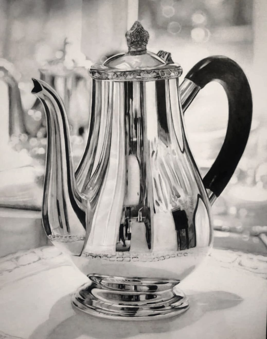
Polished metal is the opposite: intense highlights against very dark accents, plus mirrored hints of the surroundings on the surface. Plastic sits between the two, shinier than fabric, more contrast than cotton, but without true reflections. Brushed metal behaves like polished metal overlaid with a fine grain of scratches that breaks the shine into streaks.
You do not need to memorise materials to use this. Train your perception to copy the exact tones and textures you observe and the material identifies itself; the same observational habit I teach for drawing realistic skin texture works for silver, glass and everything between.
How do you make a drawing look 3D with shading, step by step?
Before your pencil touches the paper, interrogate the light. I ask my students three questions in front of every new subject: where are the lightest values, where are the darkest, and is any nearby surface bouncing light back into the shadow? Answer those and you have located the light source, the form shadow and the reflected light before drawing a single stroke.
Then build the shading itself:
- Lay your strokes close together, touching, with no white gaps between them. Scratchy, separated lines are the habit I correct most often, and no amount of blending rescues an uneven base.
- Build a value strip from a deep black at one end, lightening gradually as you move across, using softer grades for the dark end and lighter pressure as you go.
- Blend with a blending stump, following the same direction as your pencil strokes, until no boundary between tones is visible.
- Apply the same gradient around your object’s form: darkest in the form shadow, lifting through the halftone, vanishing into the protected highlight.
Repeat the exercise on a simple sphere until the routine feels boring, because boring is the point: an egg on the kitchen table under a single lamp is the cheapest art teacher you will ever hire, and ten minutes with it teaches more about volume than an hour of copying finished drawings.
The goal is a transition so smooth that nobody can point to where one tone ends and the next begins. If your finished study still refuses to convince, the fault is usually hierarchy rather than technique, and my checklist on why your drawings look bad helps you diagnose exactly which value is lying.
How do you make a drawing look alive, not just solid?
Volume makes an object believable; a few finishing decisions make it feel present. Push the contrast hierarchy: one true white and one true black somewhere in the piece give every other grey its meaning. Sharpen detail where you want the viewer’s eye to land and soften it elsewhere, exactly as a camera would.
Depth of field is the strongest of these tools: keeping your subject crisp against a softly graduated backdrop, as in my tutorial on drawing a blurry background with pencil, pushes the subject forward off the page. In portraits, the final spark usually lives in the eyes: a clean catchlight and believable skin can turn a technically correct face into one that seems about to speak, and if faces are where you are heading, my step-by-step ebooks were built to walk you from a flat sketch to a portrait with real presence.
None of this requires talent, only a trained eye and consistent practice. If you are still early in that journey, my roadmap on how to learn to draw as an adult slots this skill into the right sequence.
Frequently Asked Questions
How do you make sketches look 3D?
Commit to one light source and suggest just two of the five elements: a merged shadow side and a single cast shadow. Even in a five-minute sketch, that is enough for the eye to read volume.
The quickest improvement is refusing to outline everything with equal weight. Let the lit edge almost disappear and press harder on the shadow edge instead.
Sketching this way is also the best rehearsal for finished work, because it trains you to make light decisions fast, before detail tempts you away from them.
How do you make 2D drawings look 3D?
Through value hierarchy first: reserve pure white for the highlight, place one genuinely deep black, and let every other tone sit clearly between them. A drawing that lives entirely in similar mid greys will always read as flat, however careful the outlines are.
Then add the spatial cues: overlap shapes, make nearer elements larger and more detailed, and soften whatever sits further back.
A practical test is to squint at your drawing. If the form still reads through blurred vision, your values are doing their job.
How do you make art look 3D in any medium?
The five elements of shading transfer to every medium: charcoal, coloured pencil, paint and digital all model form the same way graphite does.
In colour work, the trap is trusting hue instead of value. A colour that looks wrong is almost always a value that is wrong underneath, so check your piece in black and white, with a quick photo filter, against your reference.
If the tonal logic matches, the volume survives in any medium; if it does not, no amount of colour, texture or detail will rescue it.
Did this article help you? You can buy me a coffee so I can keep creating free guides like this one.