Atualizado em por Rita Moreira
Ela entrou, deitou-se no divã e disse: “Acho que estou ficando louca”. Eu fiquei em silêncio aguardando que ela me revelasse os sinais da sua loucura.
“Um dos meus prazeres é cozinhar. Vou para a cozinha, corto as cebolas, os tomates, os pimentões e é uma alegria!
Entretanto, faz uns dias, eu fui para a cozinha para fazer aquilo que já fizera centenas de vezes: cortar cebolas. Ato banal sem surpresas.
Mas, cortada a cebola, eu olhei para ela e tive um susto. Percebi que nunca havia visto uma cebola.
Aqueles anéis perfeitamente ajustados, a luz se refletindo neles: tive a impressão de estar vendo a rosácea de um vitral de catedral gótica. De repente, a cebola, de objeto a ser comido, se transformou em obra de arte para ser vista! E o pior é que o mesmo aconteceu quando cortei os tomates, os pimentões… Agora, tudo o que vejo me causa espanto.”
Neste pequeno trecho da crônica de Rubem Alves, ele descreve a complicada arte de “ver”. Ato não natural e que precisa sim ser aprendido.
O que significa “ver” no desenho?
Enxergar é mais do que apenas abrir os olhos. Quando o artista desenha, ele não reproduz o que seus olhos captam no primeiro instante , ele aprende a ativar uma percepção visual aprimorada, observando formas, luz, sombra e proporções que a maioria das pessoas nunca desenvolveu. Essa habilidade de percepção é a base do desenho realista e pode ser cultivada por qualquer pessoa interessada em aprender.
Enxergar é perceber além
Você já parou para analisar se aquilo que está diante do seu olhar é verdadeiramente o que se vê? Sem dúvida enxergar é perceber além, conforme a realidade de cada um, com foco e com paciência. O artista possui este poder no olhar. A curiosidade e a sensibilidade para transmitir aquilo que a sua percepção capta.
Qualquer pessoa pode conseguir uma visão mais direta e objetiva ao se dedicar ao desenho. Pois, neste momento, o cérebro permanece suspenso em termos de julgamento. Permite ao observador ver de um modo integral e completo, e faz com que algumas pessoas expressem esse sentimento por meio de frases: “Estou vendo o que antes não via!”
Desenhando com o lado direito do cérebro
A autora Betty Edwards, no livro “Desenhando com o lado direito do cérebro“, defende que a prática do desenho pode ser aprendida por qualquer pessoa “normal” com visão e coordenação motora mediana. Segundo ela, qualquer pessoa que escreva legivelmente tem toda a habilidade manual para aprender a desenhar.
Porém, a habilidade manual não é fator primordial para conseguir desenhar, e sim outra habilidade que precisa ser aprimorada: a visão. O aprender a enxergar as coisas de maneira especial.
Segundo Betty, o cérebro participa ativamente na percepção visual dos objetos mediante a observação. No entanto, essa observação é deformada pelo ponto de vista do observador, em razão das experiências por ele vivenciadas.
Por algum motivo, há uma tendência a ver o que se quer ver. Isto é, o próprio cérebro altera essa informação sem uma participação consciente do observador. Assim, aprender a ver e perceber através do desenho altera este processo e permite uma visão mais direta e objetiva.
Betty explica que, ao desenhar, a pessoa utilizará uma parte do cérebro que é quase sempre ofuscada pelos detalhes do cotidiano. E então passará a desenvolver uma capacidade de percepção mais aguçada. Sob uma nova ótica, onde poderá enxergar novas possibilidades em tudo a sua volta.
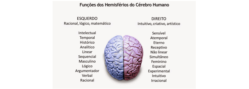
Como funciona o cérebro
Essa nova maneira de raciocinar e utilizar o cérebro dará acesso então a novas soluções criativas para os problemas, sejam eles quais forem. E você sabe como o cérebro funciona?
Visto de cima, o cérebro humano lembra as duas metades de uma noz, duas metades aparentemente semelhantes. São chamadas de hemisfério esquerdo e hemisfério direito, ligados por um feixe conector chamado de corpo caloso.
Os dois hemisférios são capazes de trabalhar em conjunto de várias maneiras. Algumas vezes cooperando um com o outro, contribuindo com suas aptidões especiais. E assumindo aquela determinada parte da tarefa mais adaptada à sua modalidade de processar informações.
Outras vezes, os hemisférios podem funcionar separadamente, com uma das metades agindo mais ou menos como “líder”. E a outra mais ou menos como “seguidora”.
E ao que parece as duas metades podem também entrar em conflito: uma delas tenta fazer aquilo que a outra “sabe” ser mais capacitada para fazer.
A função dos hemisférios
Além disso, talvez cada hemisfério tenha uma maneira de manter certos conhecimentos fora do alcance do outro.
As pesquisas sobre as funções dos hemisférios do cérebro humano relativas à percepção visual indicam que a aptidão para o desenho pode depender do fato de uma pessoa ter ou não acesso consciente à modalidade direita “secundária” ou subdominante.
Aparentemente, o hemisfério direito percebe e processa informações para podermos desenhar. Enquanto o hemisfério esquerdo percebe de uma forma que interfere negativamente no ato de desenhar.
Uma vez que o ato de desenhar é uma função do hemisfério direito, é preciso então impedir que o hemisfério esquerdo interfira na tarefa. Portanto, para desenhar um objeto observado, é preciso uma mudança mental para a modalidade cerebral especializada para executar a tarefa de percepção visual.
E é o hemisfério direito o mais apropriado para este fim. É a modalidade do artista onde não é necessário pensar, e sim intuir e sentir.
É preciso saber ver: algumas dicas
Se for necessário usar palavras para pensar, faça a si mesmo perguntas espaciais, relacionais e comparativas. Elas são típicas da modalidade direita como, por exemplo:
- Onde começa essa curva?
- Qual o ângulo em relação à margem do papel?
- Que comprimento tem essa linha em relação a esta que acabo de desenhar?
Assim você não estará nomeando partes e nem fazendo qualquer tipo de declarações ou conclusões.
Estimulando o lado direito do cérebro
Segundo os estudos de Betty Edwards, é possível estimular o lado direito do cérebro e inibir o lado esquerdo com alguns exercícios simples. Esse estímulo libera a nossa percepção de forma que passamos a “ver” as coisas com outros olhos.
Por exemplo: quando o que está diante de nossos olhos fica numa orientação não familiar (ex.: de cabeça para baixo), os processos costumeiros de reconhecimento e atribuição de nome se desaceleram e são dificultados. Até o lado esquerdo do cérebro desistir de tentar nomear e categorizar.
Logo, as partes não nomeadas se tornam interessantes por si só, assim como as relações entre as partes. O desenho de cabeça para baixo força uma mudança que afasta o lado esquerdo nomeador, classificador, do cérebro, aproximando-se do lado direito, visual perceptivo, que é o lado apropriado para o desenho.
É como se o lado esquerdo, quando forçado a olhar algo que está de ponta-cabeça dissesse, efetivamente:
“Ouça bem, eu não faço coisas de cabeça para baixo, gosto que as coisas estejam do modo como elas sempre estão, para que eu saiba o que estou olhando. Se você vai olhar as coisas de ponta-cabeça, não conte comigo!”
Para desenhar, é exatamente isso o que queremos!
Um dos segredos para o desenho realista é exatamente essa visão mais apurada, adquirida através da observação dos detalhes, como formas, manchas, tonalidades, luz, sombra. E quanto mais informações percebidas, mais realista ficará o trabalho.
Espaço negativo
Outro ponto importante a ser levado em consideração é o espaço negativo. Todo motivo tem formas positivas e negativas.
Saber reconhecê-las e usá-las de maneira criativa facilita o trabalho e permite um aprimoramento da composição, tanto de um esboço como de um desenho acabado. Na verdade, as formas negativas são tão importantes para a qualidade do seu trabalho quanto às positivas, e você deve dedicar-lhes o mesmo planejamento, cuidado e atenção.
É importante lembrar que os dois tipos de formas são determinados pela ênfase que você lhes dá; isso pode ser constatado na figura abaixo:
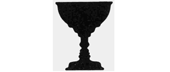
O nome dessa figura é vaso/rostos, dependendo do seu ponto de vista quem é a figura ou o fundo? Se observarmos os rostos o vaso será o fundo, todavia se você observar o vaso os rostos serão o fundo. Logo, de acordo com a atenção que você dispensar as formas elas se encaixam como em um quebra-cabeças.
Os dois são imprescindíveis para o desenho e está intrinsecamente ligada também a “arte de ver“. Como exercício, tente desenhar as formas negativas em torno de um motivo simples. Se você trabalhar com uma observação cuidadosa, chegará à forma positiva do motivo, definida pelas formas negativas que o rodeiam.
Mesmo ao desenhar “normalmente”, à medida que for registrando a forma positiva de um motivo, procure estar ciente também do espaço negativo que o rodeia. Isto tornará seu traço mais preciso.
O lado esquerdo olha o todo e erra. O lado direito observa os detalhes e os percebe.
Portanto não tenha pressa, observe, veja de forma diferente, foque nos detalhes e transmita aquilo que nem todos conseguem ver. O princípio para aprender a enxergar, ver como um artista vê, é sempre duvidar do que seus olhos veem.

Perguntas Frequentes
Por que a percepção visual é tão importante no desenho?
A percepção visual é o fundamento do desenho realista porque ela determina o que você consegue ver em uma referência. Enquanto um iniciante vê apenas “um rosto”, um artista treinado vê proporções específicas, distribuição de tons, texturas de pele, reflexos nos olhos e inúmeros outros detalhes. Quanto melhor sua percepção, mais fielmente você conseguirá reproduzir o objeto observado. Assim, desenvolver a capacidade de “ver” é na verdade desenvolver a habilidade de desenhar com precisão e realismo.
Como posso ativar meu hemisfério direito para desenhar melhor?
Existem várias técnicas para ativar o hemisfério direito e inibir o “nomeador” hemisfério esquerdo. Desenhar de cabeça para baixo é uma das mais eficazes, pois força seu cérebro a abandonar os símbolos e nomes das coisas para focar apenas em formas, ângulos e proporções. Outras práticas incluem exercícios de espaço negativo, observação de contorno em espelho, e simplesmente dedicar tempo a desenhos de longa duração onde você se afasta periodicamente para avaliar o todo. A consistência e a paciência são as chaves para fortalecer essa modalidade cerebral.
O desenho realista é uma habilidade inata ou pode ser aprendida?
Não é uma habilidade inata. Conforme Betty Edwards demonstra em seus estudos e o professor Charles Laveso ensinou em suas aulas, qualquer pessoa com visão normal e coordenação motora básica pode aprender a desenhar com realismo através da prática deliberada e do desenvolvimento da percepção. A diferença entre um artista e um iniciante não é talento “especial”, mas sim o tempo dedicado a treinar o olhar e aprimorar a técnica. Se você consegue escrever legivelmente, possui toda a destreza necessária para desenhar realista.
Vídeos Recomendados

Meu E-book foi Feito com IA - Vende 3800 por Semana

Low Ticket Definitivo: R$ 5.000 p/ Mes, 1 Produto, Sem Aparecer
Meu E-book foi Feito com IA - Vende 3800 por Semana
Low Ticket Definitivo: R$ 5.000 p/ Mes, 1 Produto, Sem Aparecer

Produto Automatico com ChatGPT - Comece a Vender em Menos de 2h

DEEPSEEK + KIWIFY: Fiz R$4.750/MES - Metodo Completo

Como Faco R$4.552 por SEMANA na KIWIFY - Nova Estrategia

Criei um Negocio do Zero com ChatGPT em 24h - Mostro Tudo