Updated on by Rita Moreira
I still remember my first blending stump: a mysterious little roll of paper that looked like it would solve every shading problem I had. Ten minutes later my drawing was blotchy, too dark in the wrong places and distinctly worse than before I started. If that sounds familiar, you are in good company.
Blending graphite is a genuine skill with its own tools, its own order of operations and, just as important, its own moments to leave well alone. This guide compares the options so you know exactly what to pick up, and when to put it down.
What is blending in graphite drawing?
Blending graphite is the act of spreading and softening graphite already applied to the paper, so that dry pencil strokes dissolve into even tone and the transitions between values become seamless. It refines shading rather than replacing it: a blending stump, tissue or brush cannot create tone, only smooth what your pencil has put down.
The ambition behind it is old. The National Gallery in London associates sfumato, the smoky, edge-free modelling of tone, with Leonardo da Vinci, and blended graphite chases the same effect with humbler tools. The classic tool is the blending stump: a tight roll of pressed paper with a pencil-like point at each end, made for working small areas with precision.
Which tools can you use to blend graphite?
Four tools cover almost every blending job, and they differ mainly in scale and intensity. The stump handles small, precise areas; a piece of soft tissue sweeps large ones; a brush pushes graphite deep into the paper; cotton wool and cotton buds sit somewhere in between. For tissue, softer is better: a plain, unprinted double-ply leaves cleaner, more even tone than anything coarse.
| Tool | Scale | Effect | Watch out |
|---|---|---|---|
| Blending stump | Small details | Precise, controlled | Deposits tone once dirty |
| Soft tissue | Large areas | Even, uniform | Little precision |
| Soft brush | Dark passages | Deep, intense, smooth | Needs trimmed bristles |
| Cotton buds | Medium spots | Soft, gentle | Fibres can shed |
The brush deserves a special mention for dark areas. Lay down a 4B or 6B first, then work a brush over it: the graphite penetrates the pores of the paper and the passage comes out darker and more even than pencil alone. Choose bristles that are neither too stiff nor too floppy, and do what I do with every new blending brush: cut the bristles to half their factory length, because at full length they are too soft to move graphite at all. Graphite ranges give you plenty of room here; Faber-Castell’s Castell 9000 series alone spans 16 hardness grades. Some artists go further with powdered charcoal spread by brush, which is really its own discipline: our guide to charcoal pencils in realistic drawing covers that territory.
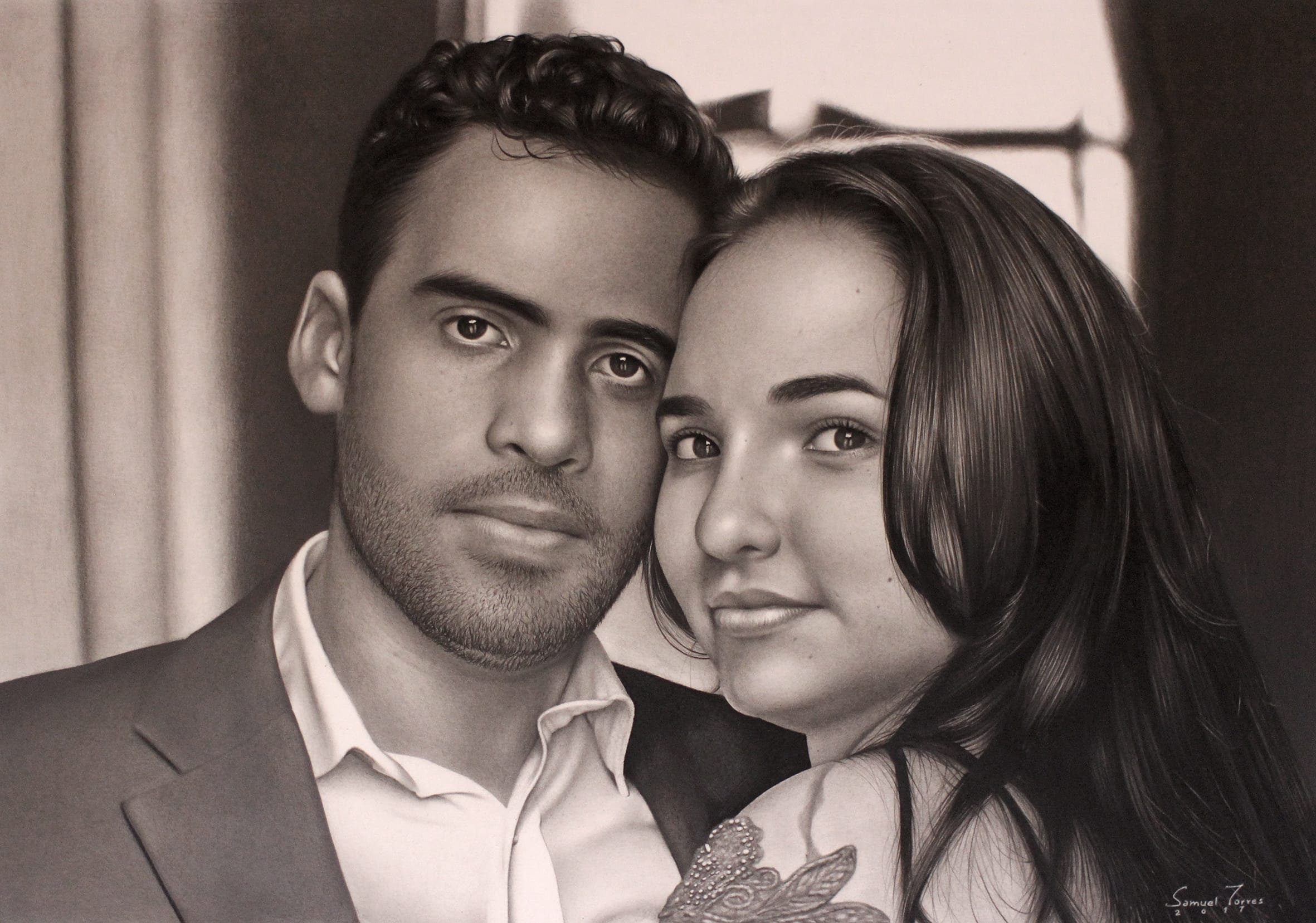
Scale is the deciding factor in practice. The fine, almost invisible blending that makes skin texture read as skin is stump work, while the broad soft wash of a blurry pencil background is tissue work. If drawing convincing faces is your goal, the skin side of this technique is exactly what my step by step guide to realistic features walks through in depth.
How do you choose a blending stump?
Softness is the quality to shop for: stumps rolled from softer paper leave smoother results. Among the widely available brands, Derwent’s are the softest I have handled, with Cretacolor and Faber-Castell close behind; all three are easy to find in the UK, and stumps come in several thicknesses.
Own at least three: one fine, one medium, one thick, so the tool always matches the size of the area. Two habits keep them working well. Keep separate stumps for light, middle and dark tones, because a graphite-loaded stump deposits tone wherever it touches. And when a tip goes shiny and saturated, a light pass of fine sandpaper renews it in seconds.
When should you not blend at all?
Blending is a stylistic decision, not a requirement. Plenty of strong pencil work keeps its strokes visible, letting hatching and the grain of the paper carry texture, hair and fabric; smoothing everything can leave a drawing looking airbrushed and lifeless. The question to ask is what the surface in front of you demands: skin and out-of-focus depth want softness, while dry wood, coarse cloth and wiry hair often want the stroke left alone.
The two approaches also live happily in one portrait. Many of my favourite student pieces pair fully blended skin with hair drawn in crisp, unblended strokes, and the contrast between the two surfaces is precisely what makes each one convincing. Decide region by region, not drawing by drawing.
Whichever side you lean towards, the values underneath still decide whether the drawing works. Blending redistributes tone, it does not design it, so the planning habits from light and shadow drawing come first, and the layered approach of realistic pencil drawing gives blending something worth smoothing. No tool substitutes for testing: a strip of scrap paper and twenty minutes with each option will teach you more than any list of recommendations, mine included.
Where can you buy the materials?
Blending stumps are cheap and usually sold in mixed-size sets, and a soft brush and decent tissues complete the kit. In the UK you will find stumps by Derwent, Cretacolor and Faber-Castell at Jackson’s Art, Cass Art or Hobbycraft, and Amazon.co.uk stocks the same sets if you prefer one basket.
Frequently Asked Questions
How do you blend graphite pencil without a blender?
Wrap a clean tissue around your fingertip: it gives you the control of a large stump without the drawback of bare skin. Cotton buds handle medium spots, and a soft brush smooths dark passages beautifully.
Avoid the bare finger itself. Skin transfers natural oils to the paper, which interfere with how later graphite layers take, leaving yellowish marks and patches that refuse to darken evenly. For quick studies it hardly matters, but on a finished piece the tissue barrier is the difference between smooth tone and permanent stains.
How do you blend graphite smoothly?
Build up light layers of graphite before you blend, rather than blending one heavy application. A stump dragged over thick graphite pushes pigment past the edges of the area and creates blotches instead of gradients.
Keep your tools clean, too: a dirty stump deposits dark tone into light areas where it should only be softening. Work with gentle, overlapping strokes, keep one stump per tone range, and refresh saturated tips with fine sandpaper. Smoothness comes from the patience of the layers, not the pressure of the blending.
What is the best way to blend graphite?
There is no single best tool, only the best match for the scale of the area. A blending stump wins for small, precise passages such as facial transitions, tissue wins for large uniform fields such as backgrounds, and a brush wins for deep shadow areas built with soft grades.
Most finished portraits use all three at different moments in the same drawing. Test each on scrap paper with your usual pencils and paper, because the right combination depends on your materials and your style.
Did this article help you? You can buy me a coffee so I can keep creating free guides like this one.